

Erth.AI
Erth AI is a no-code sandbox editor that empowers users to create and play 3D experiences enhanced by AI generation tools. The platform lowers the barrier to entry for interactive design, making it accessible to creators of all skill levels.
UI/UX, 2025
The Problem
Erth.AI had a powerful product but struggled with two critical user journey gaps:
High bounce rates on the homepage: The previous iteration simply labeled the product as an "AI sandbox editor." For new visitors, this raised more questions than it answered. Without context, the term "sandbox" was too abstract.
Steep onboarding curve: Users who signed up abandoned the editor within minutes. The 3D interface + AI tools combo felt overwhelming, and essential mechanics (movement, right-click interactions, AI generation) weren't intuitive.
How might we design a homepage that converts curiosity into signups? How do we design a tutorial that gets users creating ASAP?
Discovery & Constraints
Process
1. Competitive Audit
I analyzed onboarding flows from Roblox Studio, Minecraft Education, and Spline to identify patterns that worked and gaps we could exploit. I discovered that most tools either overwhelmed users with options upfront or hid features too deeply. A middle-ground approach through guided discovery felt right for Erth.AI's no-code positioning.
Target users:
Primary: 25–40 year-old creators, designers, and educators with minimal 3D experience
Secondary: Indie game developers looking for rapid prototyping tools
Key constraints:
The homepage needed to communicate value without video (initially) bandwidth considerations for global users
Tutorial had to work without voiceover (accessibility + localization)
Mobile traffic would be important, responsive design was non-negotiable
2. Homepage iterations
First pass: Feature-focused layout with player-made maps at the forefront
Feedback: Users still didn't grasp what they could make vs. what features existed
Final direction: Show, don't tell, led by a hero visual of a completed creation, paired with a single clear CTA
3. Tutorial Design
I mapped the minimum viable skillset needed for a "first win":
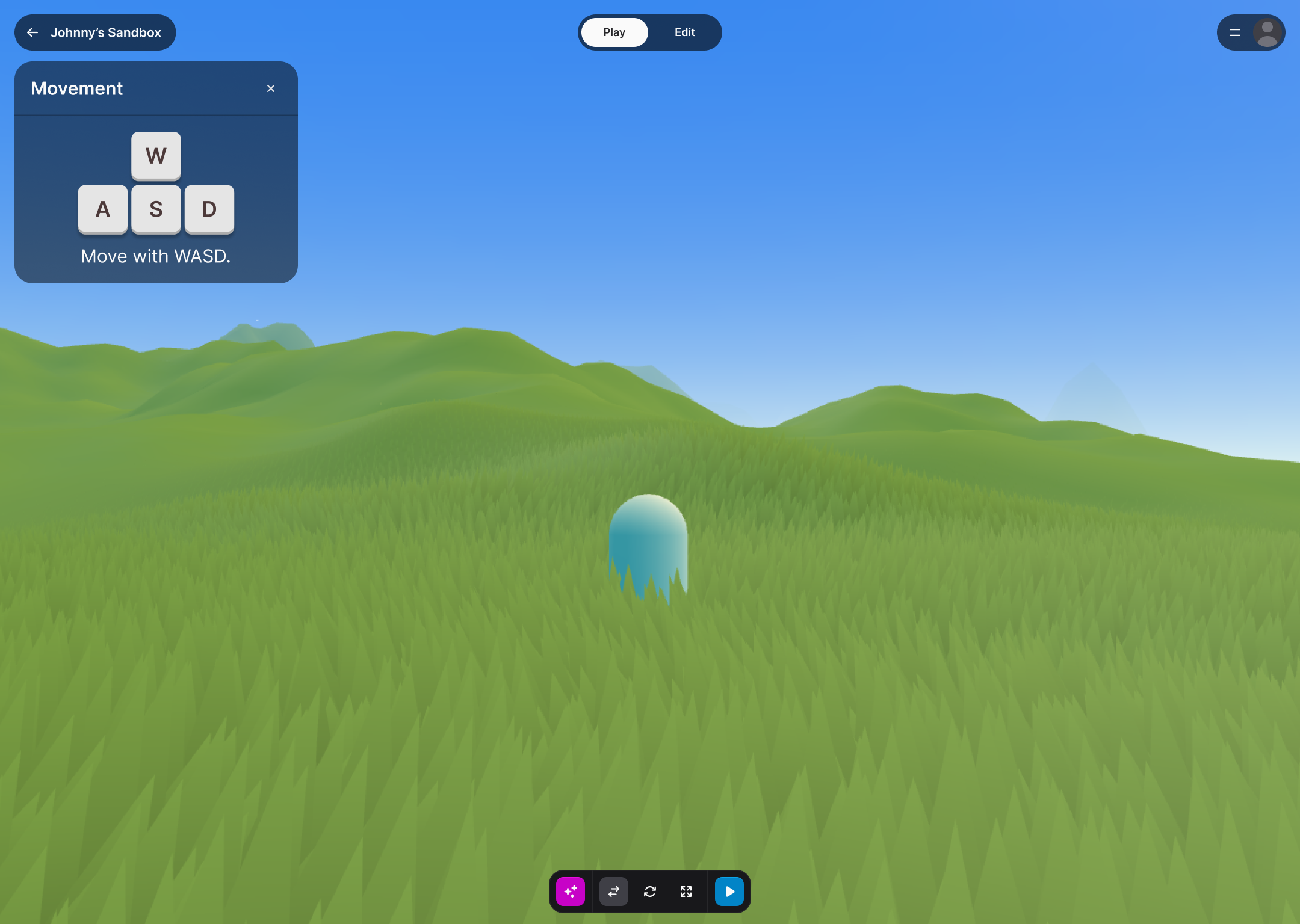
Move around the space (WASD/mouse)
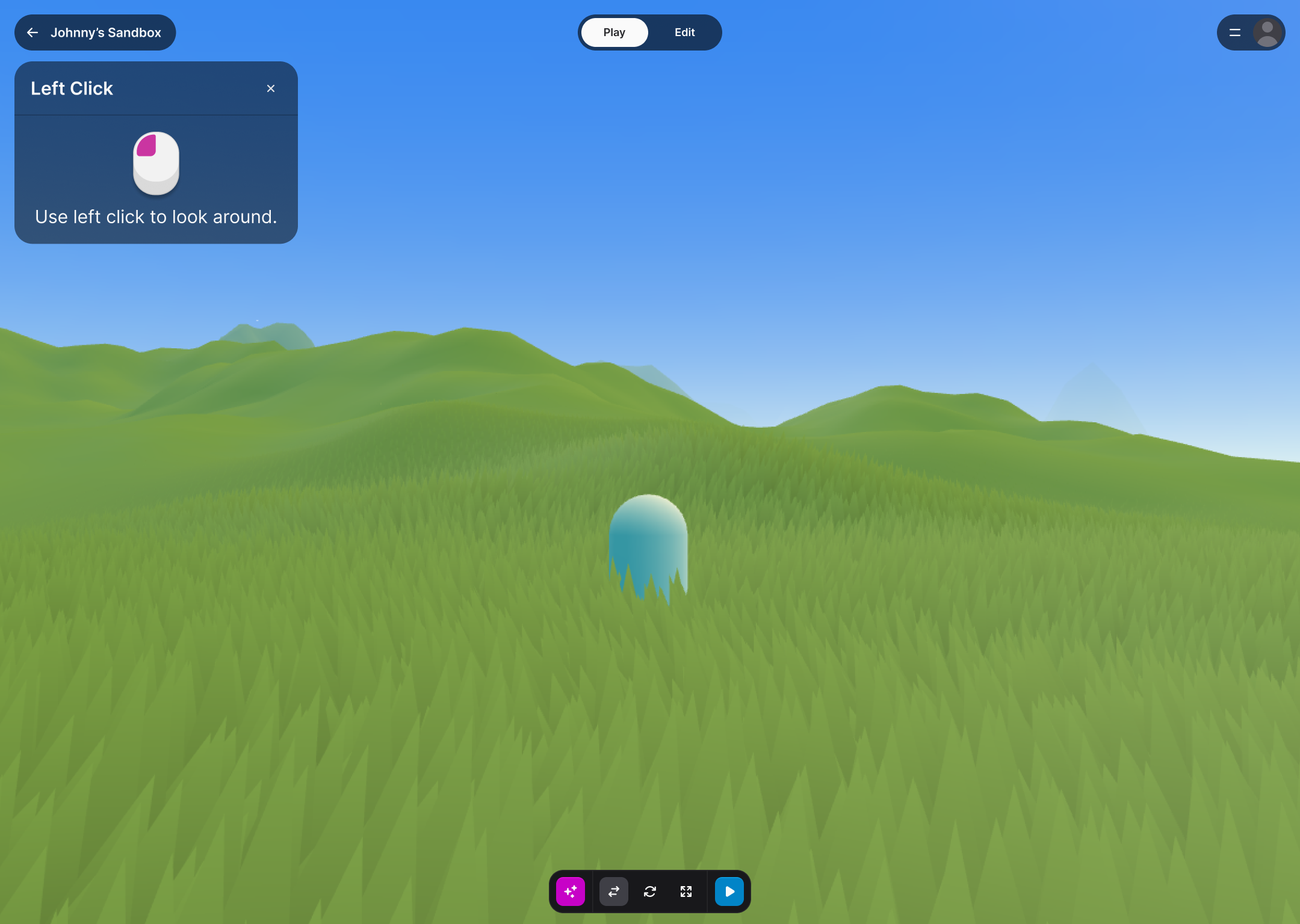
Left-click to move around the camera
Right click to open a menu and generate something with AI
Each step became a focused tutorial modal with visual demonstration and minimal copy to invoke interaction.
Home page
Mobile home page
Tutorial

Solution
Homepage (Desktop + Mobile) A conversion-focused hero that answers "What is this?" and "What can I make?" within 3 seconds:
Immersive hero visual showing a finished 3D creation (placeholder currently in place)
Experiences designed by users to show off 3D generation capabilities
A vision statement explaining the product’s no-download, no-code format.
Mobile-first layout that scales up gracefully, prioritizing touch targets and scannability
Onboarding Tutorial A 3-step guided introduction that gets users to their first creation within 3 minutes:
Contextual modals that appear at the moment of need (not all at once)
Visual icons over text, thus reducing cognitive load and supports non-native speakers
Exit option for returning users who skip the tutorial
Reflections
The biggest learning was how much visual-first communication matters for spatial tools. While I’m someone who grew up with Minecraft and video games that taught me 3D spatial awareness, I realized quickly that this wasn’t intuitive with many people. Users didn't want to read about 3D and instead they wanted to see it, click it, and believe they could make it too.